Inks · 17 July 2014 · 11 min read
Iroshizuku, Japanese landscapes on the page
The bottles we waited on in 2014 were named for weather and water. They still are. Here is how those colours behave on Australian paper, and why the cone in the base is not a gimmick.
By The Bookbinders desk
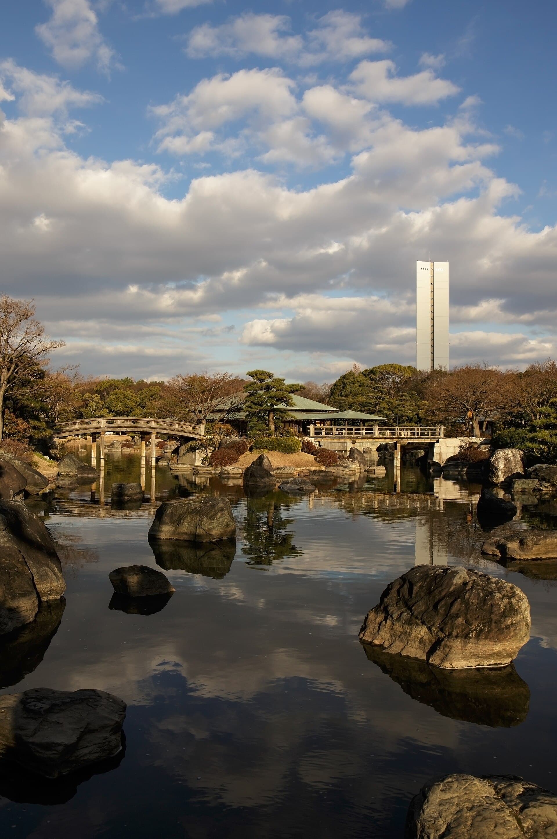
Image: Laitche. CC BY-SA 4.0. See the image credits.

In July 2014 we wrote a shop note that now reads like a founding document. We were about to stock Iroshizuku. Each bottled ink, we said, takes its name from the expressions of beautiful Japanese natural landscapes and plants. The bottle had a cone in the base so you could use the last of the colour. We were also waiting on Tomoe River. We were about to announce a physical store. The sentence was already in the first person plural of a small shop that had decided ink was not a sideline.
The names still do the work. Kon-peki, the deep sky. Yama-budo, the wild grape. Tsuki-yo, the moonlit night. Shin-ryoku, the forest. You do not need the Japanese to feel the intention, but the intention is the product. These are not office blues. They are landscapes poured into a glass that looks good on a shelf and works when the shelf is in Aspley.
What the ink is, technically
Iroshizuku is Pilot's dye-ink range: wet enough to show shading on decent paper, polite enough to flush from a Metropolitan or a Custom, stable enough that we could recommend it as a first bottle without a disclaimer novel. It is not waterproof. It is not a pigment. It will not survive a spilled glass of water on a page, and it will not cement a feed if you forget it for a fortnight.
On Tomoe River and other thin Japanese sheets the colours open. You see the dark edge and the lighter pool. On Midori MD they are themselves, a little more restrained. On supermarket pads they are still better than a nameless cartridge, and they will feather if you insist. The pairing guide is the longer version of that sentence.
The cone in the base is functional. When the bottle is low, the remaining ink gathers where a converter or a nib can still reach it. We used to demonstrate this with a bottle that had been loved down to a stain. Customers who had grown up wasting the last centimetre of a cheap bottle understood immediately.
Colour as weather, not as a swatch
Australian light is hard. A colour that looks subtle in a Japanese winter photograph can look loud on a Queensland verandah. That is not a fault. It is a reason to test on the paper you use, in the room you write in. Tsuki-yo in a south-facing Hobart room is not Tsuki-yo under a fluorescent chemist. Buy the bottle you will still like at noon.
We kept a few house favourites for people who did not want a philosophy. A blue that was not office. A green that was not school. A brown that could sign a card. A grey for architects who pretended they did not want colour. The rest was conversation. If someone was building a Traveler's for a trip, we asked where they were going and let the landscape names do their slightly shameless work.
Shading is the feature. Sheen is a cameo. If a reviewer on the other side of the world talks about a mirror of pink on Kon-peki, they are using very smooth paper and a wet nib. You may see a hint. You will see shading if you give the ink a medium or broad and a page that can take it.
Bottles on Australian shelves
These bottles travel. Glass, a good cap, a shape that does not love a packing station. We wrapped them as gifts because customers asked us to, and because a birthday that arrives as Iroshizuku is a better birthday than one that arrives as a voucher. The old testimonials said as much. Prompt, packed, a class act. That was ink, not a slogan.
Store them as you would any bottled ink: cap tight, out of the sun, not above the stove, not in the glovebox. The storage essay is climate-specific. Iroshizuku will not save you from a windowsill.
If you are choosing a first bottle, choose a colour you would wear, not a colour you would only photograph. You will write more. The landscape names will still be there on the days you only write a list.
Why we still write about them
Because they taught a shop that paper and ink were a pair. Because they gave Australian buyers a way to talk about colour that was not "blue or black". Because the bottle design respected the last of the product. And because a journal that grew out of that 2014 note should keep faith with it.
There are other beautiful inks. Some are cheaper. Some are wilder. Iroshizuku remains the bottle we would put in a stranger's hand and not worry about overnight. That is a landscape too: a shop, a counter, a colour named for weather, and a customer who came back for the next one.
A short house list, with weather attached
Kon-peki on MD in a fine Pilot: daily blue that is not office. Shin-ryoku for anyone who already likes a forest and writes in the evening. Yama-budo for cards, not for minutes. A grey for drawings and for people who swear they do not want colour and then do. These are not commandments. They are the bottles we could put in a hand without a long interview.
Take them outside. If a colour dies in noon light, it is still a good lamp ink. Say so on the label.
Waiting as a shop practice
The 2014 note was about waiting: for ink, for paper, for a door. Waiting is how a specialist shop tells the truth. You cannot always have the landscape tomorrow. You can have the sentence that the landscape is coming, and a refill at letter rate in the meantime. This journal still believes that sentence. The bottle, when it arrives, should be used, not only awaited.
Naming colours in Australian English
You do not have to use the Japanese name at the table. You can say pond-blue, grape, moon, forest. You can also learn the name and enjoy saying it. What you should not do is treat the name as a substitute for a test on your paper. The landscape is a poem. The page is the weather.
Write the name you will actually use on the bottle's base with a bit of tape. Future you, half awake, will thank you.
Questions from the bench
- Why are Iroshizuku inks so often recommended to beginners?
- They are well-behaved dye inks with a wide colour range, they clean out of a feed without drama, and the bottles are designed so you can use the last of the ink. They are not cheap, but they are rarely a first-bottle disaster.
- Do Iroshizuku inks sheen?
- Some do, a little, on very smooth paper. They are better thought of as shading inks. If you want aggressive sheen, you are shopping in a different aisle.
Further reading
Inks · 7 November 2024
Shading, sheen and shimmer without the mess
Three ways ink can be more than a flat colour, and three ways a feed can become a regret. A practical guide for Australian paper and Australian patience.
Inks · 16 October 2024
Pairing ink and paper in Australian conditions
A colour is not a colour until it dries on the page you actually use, in the humidity you actually have. Here is a pairing method that does not require a laboratory.
Inks · 5 September 2024
How to store and travel with bottled ink
A bottle is happier in a dark cupboard than on a sunny desk. Here is how to keep ink alive through an Australian summer, a suitcase, and the last centimetre in the glass.